Introducing the all new KashFlow dashboard
At KashFlow, our hard working product and engineering teams are always looking to improve the user experience our customers enjoy, and recently we’ve introduced some brand new innovation to our award winning accounting software… (drumroll!)
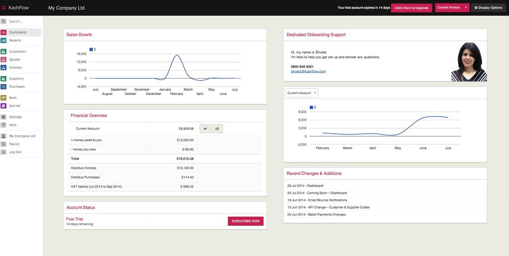
This week we’re pleased to introduce the brand new KashFlow dashboard, now available to our customers using the new, responsive user interface we launched in March.
The new dashboard replaces the ‘Overview’ page that everyone is familiar with, the one that appears immediately after logging in. Our aim was to simplify and declutter this space, and critically to allow our diverse customer base to customise what they see based on their information needs. It facilitates a ‘snapshot’ of how their business is performing, with easy access to critical information about their finances, and the ability to initiate key tasks instantly.
The dashboard is split into two columns, containing ‘modules’ of specific business information. By clicking on the ‘Display Options’ button customers can decide which modules to view on their dashboard, such as the Financial Overview module (which lets customers see at a glance the balance of their bank accounts and more) and the different Graph modules for a visual representation of how things are going. Certain tiles are completely customisable and can even include external information or even videos, whatever is required!
All items on the page (except for the ‘Alerts’ module) can be moved around to suit each customer and their needs, by simply pressing and holding a module, then moving it to the desired position. There is also a ‘quick actions’ button at the top right of the page, allowing users to quickly create and perform tasks.
More information about the dashboard is available at the KashFlow Knowledge Base.
Stay tuned for more exciting updates next month…

